
Logo Identity · SATCOM Technologies Limited · 2026
SATCOM Technologies
A satellite company needed a satellite in its logo. Studio AH found it in the O.
- Client
- SATCOM Technologies Limited
- Service
- Logo identity
- Year
- 2026
- Our work
- 2 concepts, 2 explorations, final logo, colour
- Design
- Studio AH
01 · The brief
The satellite had to be in the logo.
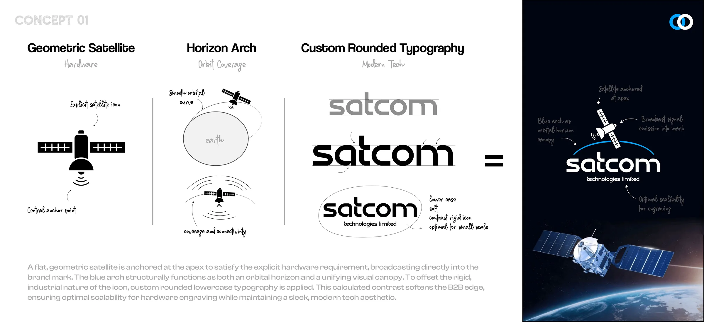
- Show the hardware. SATCOM works with satellite equipment, and they asked for the satellite to be part of the mark, not hinted at.
- Talk to businesses. Their clients are companies, so the logo had to feel solid and serious, not playful.
- Survive engraving. The mark goes onto hardware, so it had to work in one colour and at small sizes.
02 · Two directions
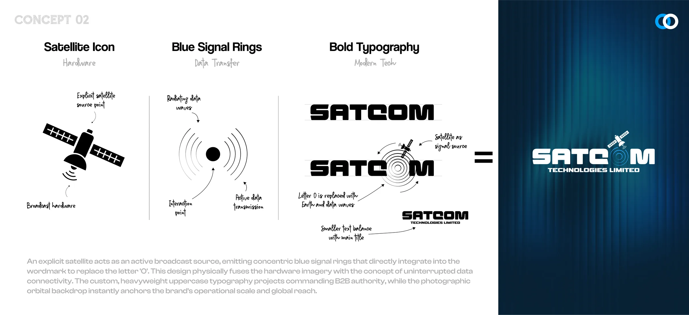
Two ways to put a satellite in a name.
03 · Also explored
Then two shorter names.


04 · The final mark
The O became the dish.
- The dish. A blue satellite dish sits inside the O, tilted up as if it is talking to the sky.
- The signal. Rings open out from the dish, the same idea as Concept 02, now packed inside one letter.
- Heavy, wide letters. SAT in blue, COM in graphite. The corners are soft, so it looks modern, not harsh.
- TECHNOLOGIES LIMITED. A wide, quiet line under the name that lines up with the C and the M.
05 · Colour
Blue for the signal, graphite for the ground.
SATCOM Blue#00A4FF
Graphite#565656
Black#000000
White#FFFFFF
06 · Small sizes
Still a satellite when it is tiny.
The dish works alone too, for an app icon, a favicon or a stamp on a device.